
Joseph Porter
AS Media
Planning
Photo Editing
First Drafts
Page Numbers


This photo was taken in a sports hall and it was therefore integral that I took out the background due to it's lack of music feeling. This was relatively easy to do due to it's simple colouring, allowing me to use the magic wand to to select the background and floor.
Then, I used the magic select tool in order to make more precise selection to take out intricacies such as space inbetween the arms and around the heads.
Next, I selected the three band members at the back in order to make the members seem more equal and take up a similar amount of the image to make it suitable for the front page.

Before
After
Since this image was fairly well taken, I did not feel the need to edit it as much and left it's core elements as they were. I did however want a summer feeling due to it's relation to a summer festival and felt it did not do this justice.
Therefore, I increased the brightness and contrast of the photo, making it look like a sun was beating down on the audience and stage and achieving the desired effect. In order to fit this onto my contents page, I cropped the relevant part of the photo to show the audience and the artist on stage.


This image was planned to be placed on a unique background on my contents page. Therefore, I used the magic select tool and seperated the band from the wall background, allowing me to replace it with a transparent background. Next, I sepeated the back and front two band members, allowing me to place text as if it was between the band.
This image was intended to be a small feature on the bottom right of my contents page, I therefore did not feel the need to spend much of my time editing.
I wanted to give this image an embedded effect, I did this by giving it a white border and adding an inner dark shadow that made the image look deeper on the page.
Additionally, I wanted to give the image a vintage look due to the nature of the feature. I did this by saturating the colours of the image and giving it an orange tint.
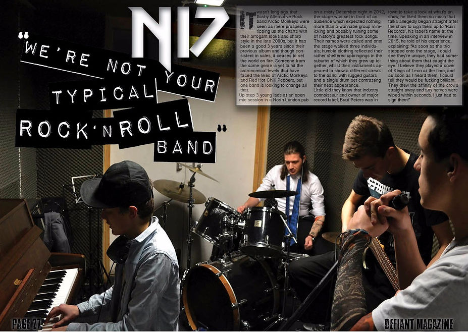
This image was fairly important as it took up an entire page on my double page spread and would therefore be given a large amount of attention by the reader.
However, I felt that the original image taken was good enough quality to hold it's own for the most part, the only adjustment I made to this photo was the brightness which I brought up slightly aswell as the contrast which I also increased in order to make the piece more dramatic.
Below is a comparison that I've made between my magazine and a leading magazine in the same genre using the same templaye as I have in my research. I performed this comparison in order to gain an idea of where my magazine stood in relation to others when it came to sales research, and therefore allowing me to make adjustments later down the line.
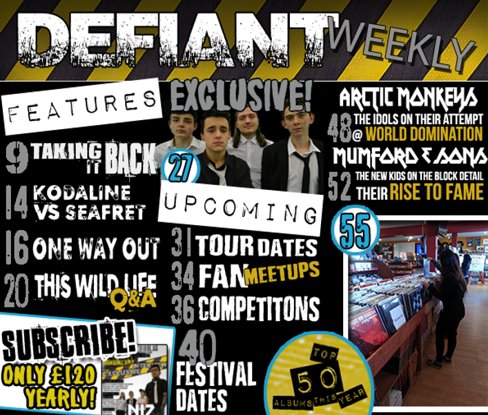
To the left is a quick draft of my contents page containing the page numbers within my magazine. As you can see, I've put a pure emphasis on the more important features of my magazine and have decided to have a lower page amount due to it's weekly release.
The more important stories are accompanied by page furniture that allow them to stand out from the page such as their own image or a round bubble with a larger number.
I have also put less of a push on advertisement within my magazine in the hope that focusing on content with allow my main revenue stream of cover prices to increase and therefore increase the brand of the magazine.

