
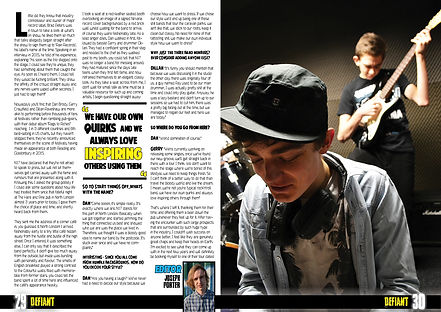
Joseph Porter
AS Media
Planning
Magazine Identity
Final Images
Peer Feedback
Front Page
Decision Process
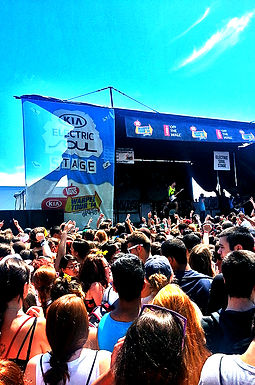
The process of selecting an image for my front cover was challenging as it was hard to find an image where all band members had an expression that would lure the reader into a story. I selected this image as I felt it held the strongest against these characteristics, with the main icon being the main singer, who is the closest to the camera and therefore the largest on the page, and the bands members behind him.
This is a pose commonly seen in posters by bands such as The Killers, allowing the reader to associate with the band easily. Two of the band members are establishing a direction of gaze whilst the other two look away, this suggests a connotation of conflict within the band and possibly provides a narrative for my article.
Placement
The image is positioned across the entire width of the front cover, making it stand out and ensuring it's prevalence provides an insight into the importance of the artists to this edition of the magazine. They are the largest element on the front page and are directly below the masthead with the cover lines revolving around them.


Contents Page


Double Page Spread
Decision Process
In order to make my contents page seem lively, so that readers gained the impression of a magazine packed with content, I picked a variety of images from all sides of the music industry that were related to multiple stories withi my magazine.
My exclusive story image consisted of my main artist in the same clothing as the main content, allowing my reader to immediately recognise the band as the cover artist. I also chose a festival to be the main large image of the contents page, I did this to make the page colourful and stand out to the reader as they flicked to the page.
Placement
I positioned the main image across the entire top half of the page in order to immediately attract the audience's eye. The other images were placed alongside their corresponding featured stories.
Decision Process
For my two Double Page Spreads, I had a wide variety of images to choose from due to two extensive photoshoots I took of the band. My mind was torn between featuring a music studio shot or an edited image onto my DPS, however, I eventually concluded that a music studio shot would be much more beneficial due to it's connection to the article aswell as it's connotations as a musician and I felt they had more passion.
Both images showed the band playing instruments in a private setting, this created a rapport between the band and the reader because they believe that they're gaining exclusive information or images from the magazine by getting a view that not many people do.
Placement
In the first image, I decided to place the image over both pages due to it being landscape, this also allowed me to experiment with page furniture, eventually adding a stylised quote aswell as an introduction paragraph above the main artist. The contrast of the image allowed me to add the paragraph article without it taking away from the image.
The second image was more straight forward as there were not many portrait images taken on the day, this was a mistake made by myself on the day. However, I felt like the quality of this photo was excellent and was able to hold it's own. I placed this image on a page of it's own, this is because it is a close-up with subtle expression, meaning that the reader would benefit greatly if it was not obscured and would be able to accurately observe the artist's emotions to a greater effect.
Main Artist

Throughout my magazine, I gave my main artist a sense of importance and prevelance on the page in order to connote a feeling of popularity for my artist. I gave them prevelance on the main cover by allowing them to take up the majority of the page, with their name being the largest piece of text. On the contents page, I connected them to the front page by placing an image of them in the same clothing as the main cover and therefore drawing the reader's eye whilst not giving too much away from the story, this is emphasized by the large exclusive above this image.
On the double page spread, their importance is obvious as two large images of them take up the page, however, they are casual in this image and seem to have more relaxed expressions, showing the reader that they are building a rapport with the band and are opening up to the reader, giving them a sense of value from the story.


Magazine Brand Name
The brand name of a magazine is very importance in being identifiable to a reader and is therefore one of the most prevalent features of most magazines in my genre including my own. The main colour scheme is yellow, black and blue, which is clearly shown on all pages of the magazine, with an equal amount of space given to each colour.
Defiant magazine is placed in the top left of my magazine, making it one of the first things the reader scans when they look at my magazine on a shop shelf, this continues onto the contents page where Defiant is seen as the centerpiece of the page and reinforces subliminally to the reader of the magazine they are reading, allowing them to easily remember the name in the future. The name is always surround by one of the three main house style colours in order to stay consistent. This is emphasized by my DPS, which contains the name of the magazine next to the page number on every page, this is very effective because it means that the reader will see the name every time they check which page they are on.


Key Points
-
Layout of front page is accurate and realistic.
-
Good use of positioning, font, colour and mise en scene in order to represent the genre.
-
Page furniture is creative and adds to the house style of the magazine.
-
The "magazine" of the masthead is large and takes away from 'Defiant'.
-
The main image lacks expression.
-
Good use of a range of design elements in order to lure the audience's eye.
-
Images work well to cut up the content and attract the reader towards a feature.
-
A range of fonts is used effectively in order to convey different moods for features.
-
The page is quite busy and it can be difficult to know where to look.
-
Two titles can be quite confusing for the reader.
-
The images are cropped and positioned well so that the instruments can be seen aswell as the expression on the faces of the band.
-
Both images also look realistic with the band genuinely looking like they are playing and meet the connotations of an alternative rock band.
-
The article relates well to the images with the use of a small music studio and specific band members used.
-
Page features such as pull quote, drop caps and editors image are used effectively to break up the text, with text formatting on the questions.
-
There is minimal use of the colour shown on pages such as the contents page which is not consistent with the house style.
-
Editors section challenges the standard convention of placement and the image of the editor.
Front Page
Contents Page
Double Page Spread
House Style
-
Excellent colour scheme that catches the eye of the reader when on a shelf straight away.
-
The basic colours are consistent acrossall pages with each colour seen atleast once on each.
-
The page numbers and magazine name are seen on the DPS and reinforces the brand of Defiant well.
-
Each feature is consistent with all pages, e.g: the DPS is shown on the contents page as 27, which is accurate.
-
The name magazine is not very catchy and doesn't compete with the main image for the cover page.

